
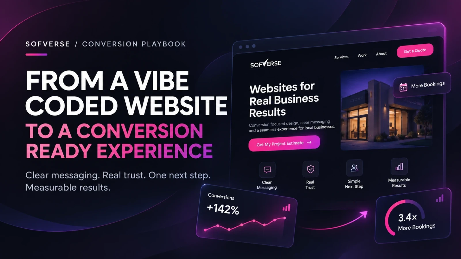
Vibe coding can give you a professional looking website in an afternoon. AI can write components, suggest layouts and assemble an impressive interface. But a beautiful page is not automatically a persuasive one. If visitors arrive and leave without calling, booking or buying, your website has a conversion problem, not necessarily a coding problem.
The solution is to keep the speed of AI assisted development while applying real conversion strategy. Here is how to turn a vibe coded website into a business asset that earns measurable results.
Why do vibe coded websites struggle to convert?
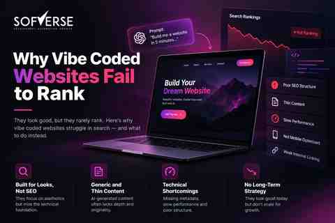
AI generates what you request, not what your customers actually need. A prompt like “make a modern agency website” often produces animated sections, vague claims and several competing buttons. What is missing? A specific audience, a compelling offer and evidence that the business can deliver. Our guide to why vibe coded websites fail to rank explains the related search visibility problem. Conversion requires a separate set of decisions.
1. Give each page one measurable job
Before changing the design, choose the action that matters: request a quote, schedule a consultation, purchase a product or start a trial. Assign one primary call to action to each page. Secondary links can support the journey, but they should not compete visually with the main decision.
For example, a home services page should prioritize “Request a quote” over generic buttons such as “Explore,” “Discover” and “Learn more.” Connect that action to your CRM, booking system or order flow so you can verify it actually works.
2. Rewrite the first screen around customer intent
The hero section must answer three questions immediately: What do you offer? Who is it for? What happens next? Replace “Transforming digital experiences” with a concrete promise such as “Responsive websites for local clinics, designed to make appointment requests easier.” Pair it with one visible button.
Show a relevant product, service or result instead of decorative imagery. Match the headline to the ad, search query or email that brought someone to the page. Sofverse approaches this through conversion focused web design and UI and UX design, where message clarity comes before animation.
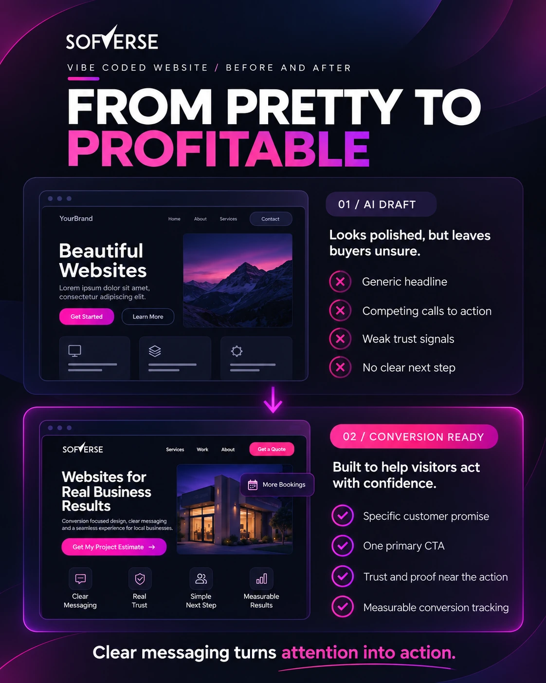
From pretty to profitable: the actual custom Sofverse before and after artwork.
3. Build a short path from interest to action
A visitor should not need to search for the next step. Organize the page in a logical order: clear offer, benefits, evidence, objections and call to action. Use descriptive button labels such as “See available appointments” or “Get my project estimate.” Repeat the same primary action after important proof sections when the page is long.
Keep lead forms short. Ask only for information needed to respond, then request additional details later. Test submission, validation, confirmation messages and notifications yourself. A form that looks finished but never delivers an enquiry is a costly AI generated bug.
4. Put trust beside the decision
Customers need proof, not adjectives. Add genuine reviews with permission, relevant portfolio work, a clear explanation of the process and accurate contact details. Use authentic team or project imagery whenever possible. Never invent client testimonials, performance statistics or certifications to make the design appear credible.
Relevant examples matter more than a wall of logos. Explore Sofverse’s Matti Tech Services website project for a technology services example and the Phage Therapy USA project for a healthcare website involving contact and booking flows. Treat them as examples of project structure, not unsupported conversion guarantees.
5. Fix the mobile experience and technical friction
Many generated layouts look excellent on a wide monitor and break on a phone. Check real screen sizes, tap targets, sticky elements, readable text and the space around forms. Compress images, limit unnecessary animation and avoid shipping heavy libraries for minor effects. Test keyboard navigation, labels, contrast and error states as well.
Fast loading, accessible pages reduce friction, but performance scores alone do not prove higher conversions. Prioritize issues that prevent a real person from understanding or completing the action.
6. Measure what happens after the click
Install privacy appropriate analytics and track meaningful events: form submissions, confirmed bookings, purchases or qualified calls. Distinguish a button click from a completed conversion. Define your conversion rate as completed goal actions divided by relevant visits, using one consistent measurement method.
Break results down by mobile versus desktop, traffic source and landing page. Investigate where users stop. If people click “Book a call” but abandon the form, the bottleneck may be the booking flow rather than the headline.
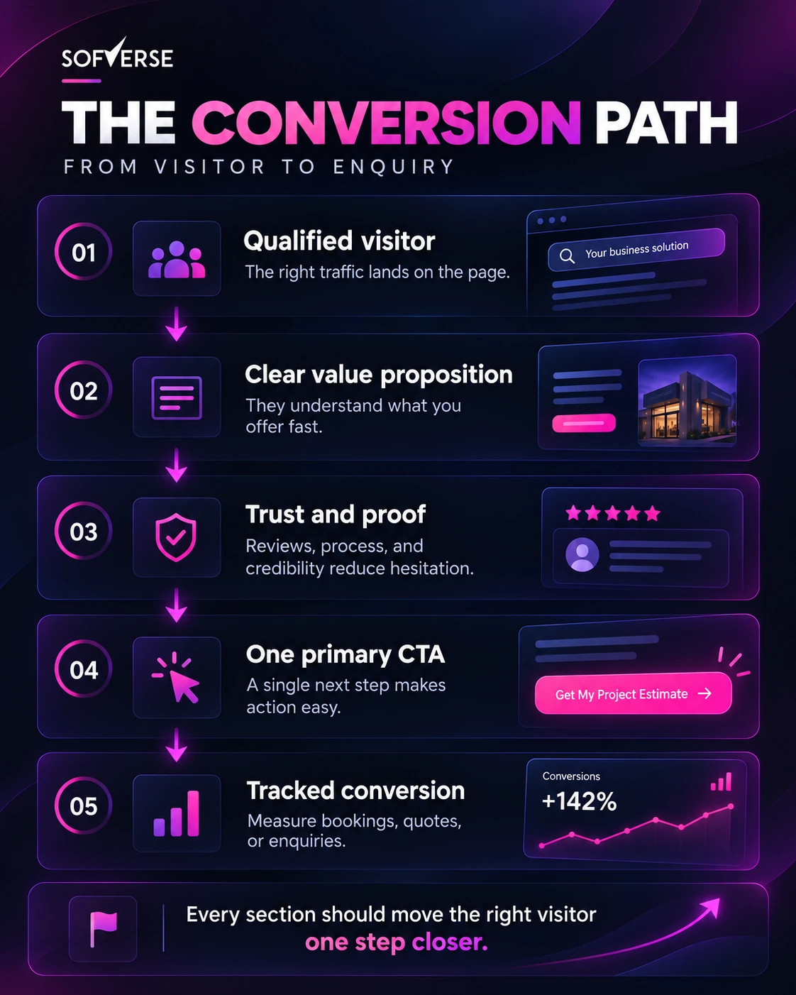
The conversion path: a complete visual journey from visitor to enquiry.
7. Test one hypothesis at a time
Do not regenerate an entire website every time results disappoint. Write a specific hypothesis, such as “A clearer consultation button will increase completed booking requests.” Change one meaningful element, then compare outcomes over a sensible period. Account for traffic volume and variation before calling a winner.
Start with the headline, offer, trust placement or form length. Use feedback from actual customers to understand why they hesitate. AI is useful for producing alternatives; analytics and user behavior decide which version stays.
8. Align SEO and local pages with conversion intent
Organic traffic is only useful when visitors find an appropriate next step. Give each service page a distinctive purpose, useful copy, relevant proof and a clear contact route. Review Sofverse’s SEO strategy services for the search foundation.
Local businesses can also study the structure of targeted Austin web design and Los Angeles web design pages. The goal is not to duplicate city names across hundreds of AI pages. It is to answer what buyers in each market actually want to know.
A practical seven day conversion checklist
- Day 1: Pick the primary conversion and verify analytics.
- Day 2: Rewrite the headline, offer and main button.
- Day 3: Add real proof near the primary decision.
- Day 4: Test the complete contact or checkout flow.
- Day 5: Fix mobile layout, accessibility and loading issues.
- Day 6: Review the visitor journey and identify one bottleneck.
- Day 7: Launch a focused test and establish a baseline.
A week is enough to improve the foundation, not necessarily enough to establish a statistically reliable uplift. Continue measuring and refining as data accumulates.
The bottom line
Vibe coding is an excellent shortcut to a first version, not a substitute for customer research, persuasion or testing. Keep the speed, then add clear positioning, credible proof, frictionless interactions and measurable goals. If you want an experienced team to review the journey, explore our web design portfolio and talk with Sofverse about your project.

sofverse
The Sofverse team designs, builds and scales websites, web applications, automation and growth systems for businesses across the United States.
More articles
1 comment
Comments are closed.