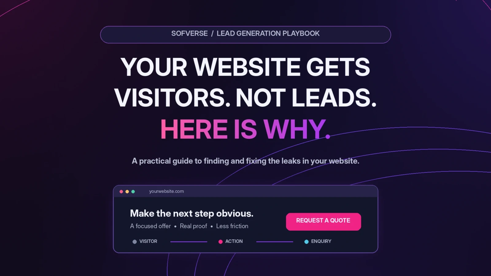
Your website looks good. People visit it. Maybe you even pay for ads or invest in SEO. Yet the contact form stays quiet and the phone rarely rings. Before spending more to drive traffic, ask a more useful question: where does the journey from visitor to enquiry break?
A website cannot guarantee leads. It can, however, give the right visitors a clear reason to trust you and an easy way to take the next step. Here is a practical way to diagnose the problem and fix it, without rebuilding everything blindly.
Start with the number that matters
Traffic is the number of visits. A lead is a meaningful action, such as a completed quote request, confirmed booking, or relevant phone enquiry. A click on a button is not the same as a completed lead.
Calculate your website lead rate as qualified enquiries divided by relevant visits, multiplied by 100. For example, if 500 relevant visits lead to 10 genuine enquiries, that is 2%. This is an illustration, not a universal target. Compare the same page, audience and measurement method over time before deciding whether the rate is good or bad.
Six reasons your website may not generate leads
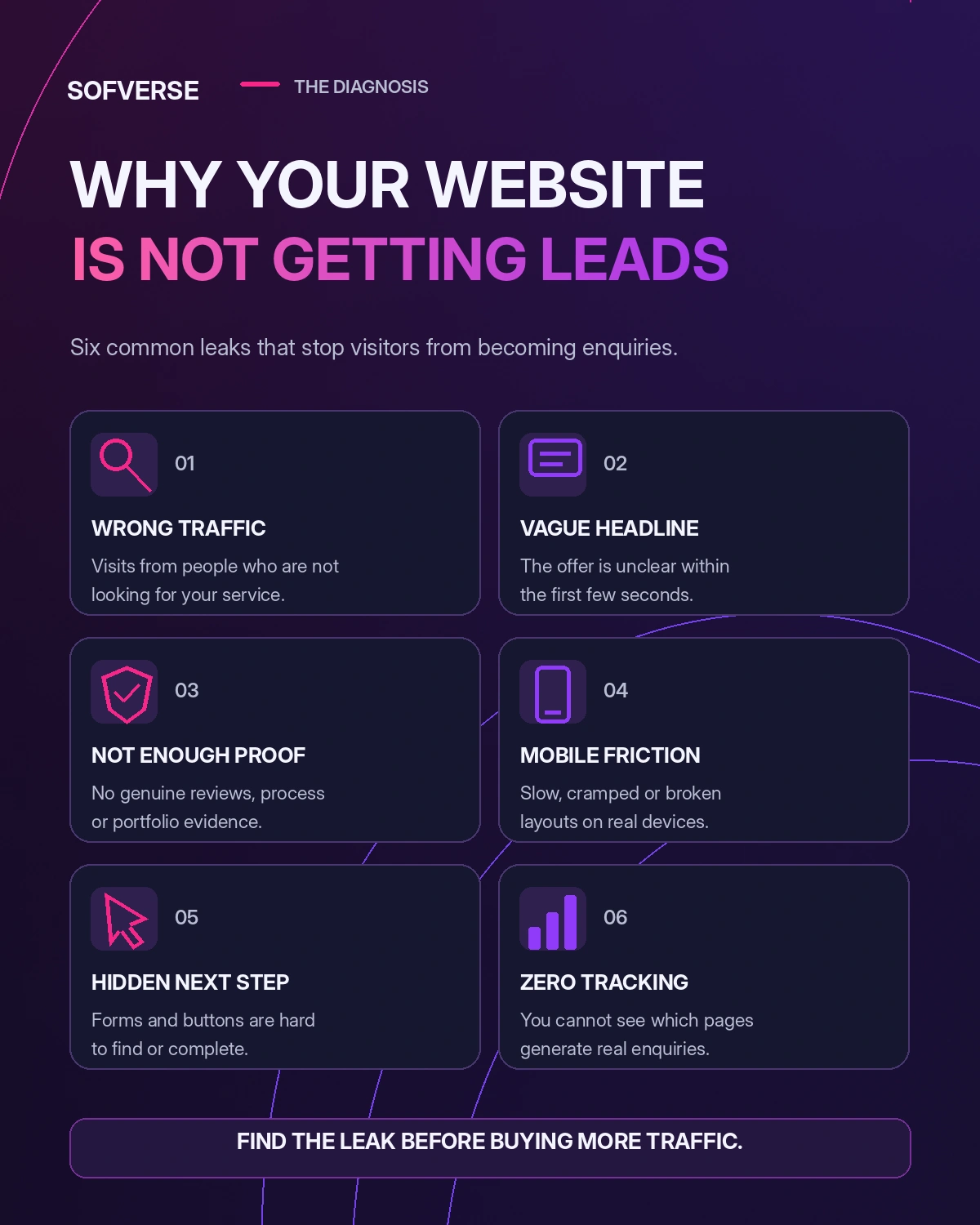
Six common problems to check before spending more on traffic.
1. You attract visitors who are not ready to buy
Someone searching for “how to fix a dripping faucet” has different intent from someone searching for “emergency plumber near me.” Educational traffic can support awareness, but it may not become an immediate enquiry. Review the search queries, ads and referral sources sending people to each page. Create useful service pages for buyers with a real problem and a clear location or service requirement. A thoughtful SEO strategy should connect search intent to pages that answer it.
2. Your headline describes the business, not the outcome
“Innovative solutions for modern businesses” sounds polished, but it tells a visitor almost nothing. Replace vague claims with a specific service, audience and result. For a roofing company, “Roof repairs and replacements in Denver. Request a written estimate” is more actionable than “Quality you can trust.” Put the primary button beside the promise, not several screens down the page. Clear web design begins with this message, not with animation.
3. Visitors cannot find enough reason to trust you
Buyers compare options and look for signs of reliability. Show genuine client feedback with permission, recent work, how the service is delivered, realistic timelines and accurate business details. Put relevant evidence close to the enquiry button. A clinic might show practitioner qualifications and an appointment process; a contractor might show completed projects and service areas. A well organized portfolio helps visitors see what your work actually looks like.
4. Contacting you takes too much work
A long form, a broken booking link or a phone number hidden in the footer creates friction. Ask only for the information needed to start a useful conversation. A service enquiry often needs a name, contact method and a brief description; complex details can come later. Label fields clearly, confirm successful submission and send the request to a monitored inbox or CRM. Test the entire process as a customer, including the confirmation email and the team’s response.
5. The mobile experience gets in the way
Check your site on a real phone. Can someone read the headline without zooming? Is the main button obvious? Do dropdowns, sticky headers and popups block the form? Do images load quickly? Compress oversized files, simplify effects and make buttons easy to tap. Good UI and UX design focuses on making the task comfortable, not just making the screen attractive.
6. You do not know where enquiries disappear
If you only track page views, you cannot tell whether visitors abandon a form, click the wrong button or submit an enquiry nobody receives. Record completed form submissions, confirmed appointments, qualified phone enquiries and purchases where relevant. Segment them by page, device and traffic source. Marketing analytics should show which marketing efforts create meaningful conversations, not merely activity.
How to fix the problem in the right order
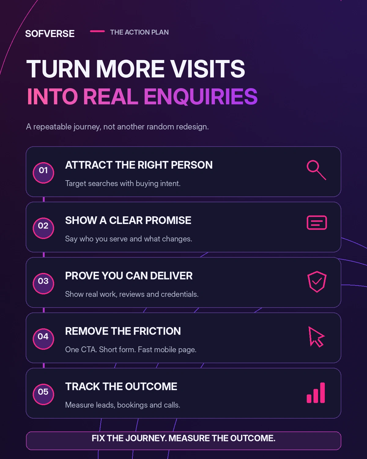
A practical five step process for turning relevant website visits into enquiries.
Resist the urge to redesign the whole site immediately. A beautiful replacement with the same unclear offer will recreate the problem. Work through these five steps instead.
Step 1: Check the audience
List your five most visited landing pages and the sources of those visits. Ask whether a visitor arriving from each search, ad or email actually needs the service promoted on the page. Move the most qualified traffic to the most relevant offer. Use a dedicated service page when different services solve different problems.
Step 2: Make the offer unmistakable
Rewrite the first screen with a clear formula: who you serve + what you do + what the visitor should do next. For example: “Family dental appointments in Austin. View available times.” Use one main call to action, then reinforce it after important sections. Keep the promise consistent with the advertisement or search result.
Step 3: Answer the objection before asking for contact
What might stop someone from enquiring? Price uncertainty, doubts about expertise, unclear location, time commitment or fear of being chased by sales calls are common examples. Address the real objections with transparent service details, a simple process and relevant proof. Never manufacture reviews or pretend that illustrative numbers represent client results.
Step 4: Remove friction from the enquiry path
Open the site on both Android and iPhone if possible. Fill out the form, book a test appointment and tap the phone link. Confirm every notification arrives. Make sure your team knows who owns the new lead and how quickly to respond. If follow up is inconsistent, consider a simple email automation system for acknowledgements and routing, while keeping personal replies for genuine enquiries.
Step 5: Measure, improve and repeat
Choose one meaningful conversion event for each page. Compare enquiry quality as well as quantity. If visitors reach the booking page but do not finish, investigate the form. If nobody clicks the main button, test the offer or its placement. Change one important element at a time where possible, and allow enough traffic to evaluate the result. For AI generated websites, our related article explains how to make a vibe coded website convert.
A 30 minute website lead audit you can do today
- Five minutes: Open your homepage on a phone and state your offer out loud after five seconds. If the offer is unclear, revise the headline.
- Five minutes: Find the primary enquiry button and check where it leads. Remove competing actions from that section.
- Five minutes: Check for genuine reviews, relevant work and clear contact information near the decision point.
- Five minutes: Submit a real test enquiry and verify it reaches the person who should answer it.
- Five minutes: Review traffic sources and the most visited landing pages. Identify any obvious mismatch in intent.
- Five minutes: Confirm that analytics record a completed enquiry, not just a click.
Do you need a complete redesign?
Not always. If the site is fast, accessible and easy to update, start with messaging, page structure, proof and form improvements. A redesign becomes more reasonable when the existing layout makes these changes difficult, the mobile experience is fundamentally broken or the site cannot reliably support essential integrations. Either way, set a measurable business goal before changing the design.
What if you get enquiries but they are poor quality?
Add clarity, not friction for its own sake. State the service area, who the offer suits and what the customer should expect. You might ask one qualifying question in a form, but avoid making every visitor complete a long survey. Review lead quality with your sales team and update the page using what you learn. Your growth strategy should connect lead generation with the actual customers you want.
The goal is not more visitors. It is a better path to action.
You do not need another generic marketing trick. You need the right audience, a clear promise, honest proof, a simple contact experience and reliable measurement. Those fundamentals help turn a website from an online brochure into a useful business tool.
If your website receives traffic but produces too few meaningful enquiries, contact Sofverse. Share your current site and the action you want visitors to take. The first priority is to identify the biggest leak, then make changes that can be tested against real results.

sofverse
The Sofverse team designs, builds and scales websites, web applications, automation and growth systems for businesses across the United States.
More articles